Posts

Showing posts with the label Mobile website

Transforming Brands with Creative Graphic Design: Explore Xperience Marketing Solutions’ Online Design Services

Image
  In today’s digital-first world, a strong visual identity is essential for any brand looking to make an impact. Xperience Marketing Solutions specializes in creating designs that not only look great but also align with your brand’s goals and values. Their   Creative Graphic Design & Online Design Services   cover a wide range of offerings, including: Logo Design : Crafting unique and memorable logos that represent your brand’s essence. Branding: Developing cohesive brand identities that resonate with your target audience. Social Media Graphics : Designing eye-catching visuals tailored for platforms like Instagram, Facebook, and LinkedIn. Web Design : Creating user-friendly and visually appealing websites that drive engagement and conversions. Why Creative Graphic Design Matters A well-executed design can make all the difference in how your brand is perceived. It’s not just about aesthetics; it’s about creating a visual language that communicates your brand’s stor...

Unlocking the Power of Web Development and Design: Explore Xperience Marketing Solutions Portfolio

Image
In the digital age, your website is often the first interaction a potential customer has with your brand. It’s not just a virtual storefront—it’s a reflection of your business’s identity, values, and professionalism. At Xperience Marketing Solutions, we specialize in creating stunning, functional, and user-friendly websites that leave a lasting impression. Our    Web Development and Design Portfolio   showcases our expertise in HTML, CMS, and WordPress development, and we’re excited to share how we can help you elevate your online presence. Why Web Development and Design Matter A well-designed website is more than just aesthetics; it’s about creating an experience that engages visitors and drives results. Whether you need a simple HTML site, a dynamic CMS platform, or a customizable WordPress solution, our team has the skills and creativity to bring your vision to life. In our portfolio, we highlight the importance of combining cutting-edge design with seamless functional...

Before & After Design

Image
  Transforming Brands with Before & After Design: A Digital Evolution In today's digital-first world, having a visually appealing and user-friendly online presence is essential for business success. Whether it's a website, social media platform, or digital advertisement, design plays a crucial role in attracting and retaining customers. At Xperience Marketing Solutions, we specialize in breathing new life into outdated designs, transforming them into powerful marketing tools that drive results. The Power of Before & After Design Great design is more than just aesthetics; it’s about functionality, user experience, and brand storytelling. Our Before & After Design portfolio showcases the incredible transformations we’ve achieved for businesses looking to enhance their digital presence. By revamping layouts, optimizing content, and refining visual elements, we help brands stand out in a competitive marketplace. Website Transformations: More Than a Facelift An outdated...

Top Reasons Your Business Needs a Mobile-Friendly Website

Image
It feels like every day new statistics are released about the rising prevalence of mobile usage in the world - more and more people are accessing their email, viewing websites, engaging on social media, and making purchases, all from the convenience of their phones or tablets. It’s safe to say, if your website isn't optimized for mobile, you’re missing a significant portion of your target audience. The time is now to get your website into tip-top, mobile-friendly shape for maximum business exposure. Unconvinced? Don’t just take our word for it. Take a look to this new info-graphic which outlines the top reasons your business needs a mobile-friendly website right now. Among the key facts outlined in the graphic are: 1.2 billion people worldwide are accessing the web from mobile devices. Since Google’s algorithm update in April 2015, Responsive Design is now preferred in Google’s rankings over having a separate mobile website, or not having a mobile-friendly website at all. ...

Is Your Website Mobile Friendly?

Image
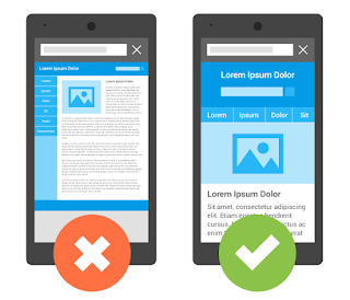
The use of mobile devices is increasing steadily every day. The cell phones of yesteryear that were used to receive and make calls are being replaced with a dizzying array of intelligent devices that offer the user hundreds of functions design to smooth and facilitate the tasks of everyday life. There is a device that appeals to every kind of user, and they are widely available. Furthermore, the technology that makes them so user friendly shows no sign of slowing down, and it can be expected that they will only be more intuitive and useful in the future. Knowing this information, it’s no surprise that the number of users who are expected to use their device to make online purchases will jump 26% by 2017. This opens up a whole new segment of the population as potential customers for your brand, the people who prefer to browse the web from their mobile device(s). Even if you already have a well-established website, optimizing the site for mobile access requires adhering to some pa...

The Top Reasons Your Business Needs a Mobile-Friendly Website

Image
It feels like every day new statistics are released about the rising prevalence of mobile usage in the world - more and more people are accessing their email, viewing websites, engaging on social media, and making purchases, all from the convenience of their phones or tablets. It’s safe to say, if your website isn't optimized for mobile, you’re missing a significant portion of your target audience. The time is now to get your website into tip-top, mobile-friendly shape for maximum business exposure. Unconvinced? Don’t just take our word for it. Take a look to this new info-graphic which outlines the top reasons your business needs a mobile-friendly website right now. Among the key facts outlined in the graphic are: 1.2 billion people worldwide are accessing the web from mobile devices. Since Google’s algorithm update in April 2015, Responsive Design is now preferred in Google’s rankings over having a separate mobile website, or not having a mobile-friendly website at all. ...